Park Avenue had a strong and established brand equity, but changing consumer expectations and an evolving grooming landscape called for a refreshed expression for its soap range. The category was dominated by familiar visual conventions, while the soap range needed to communicate its grooming benefits with greater clarity and distinction. The challenge was to create a packaging system that could strengthen the existing brand equity, improve shelf impact, and give each variant a clear and compelling role within the portfolio.
Lokusdesign studied the category, competitive landscape, consumer expectations, and the evolving visual language of premium men’s grooming to identify opportunities for differentiation. The resulting strategy focused on making product benefits more intuitive while creating a stronger visual relationship between the Park Avenue brand and its individual variants.
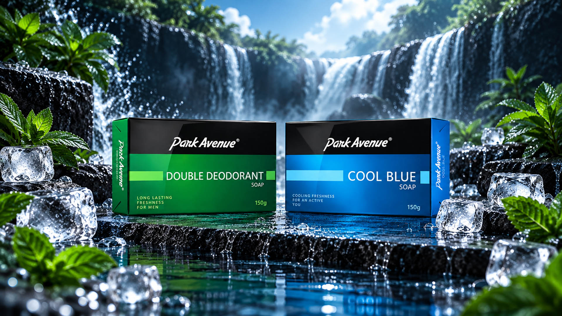
A distinctive packaging design system was developed across the Original, Double Deodorant, and Cool Blue variants. A consistent brand structure, strong typography, dynamic graphics, colour differentiation, and retained Park Avenue equity created a recognisable portfolio while allowing each variant to communicate its own fragrance, freshness, and performance proposition.
The result was a more cohesive and contemporary soap portfolio with stronger shelf visibility, clearer variant communication, and enhanced brand recall. The design system also created a scalable foundation for future variants and product extensions, helping Park Avenue strengthen its presence within the premium men’s grooming category.