Bajaj Electricals had strong legacy and consumer trust, but the retail environment was becoming increasingly competitive and visually congested. Products across the category were adopting similar colours, imagery, layouts and communication cues, making differentiation increasingly difficult at the point of purchase.
The visible brief was to redesign Bajaj’s packaging.
The hidden business brief was:
How could Bajaj make its brand work harder now of purchase, winning attention, building recognition and making product choice easier in a highly cluttered retail environment?
Retail and consumer behaviour created another layer of complexity. Customers used packaging to identify and understand products, while retailers continued to influence purchase decisions, particularly in traditional retail.
The opportunity was therefore bigger than aesthetics:
Stand out → Get recognised → Get understood → Get considered → Get chosen
The packaging had to perform simultaneously as a brand asset, sales tool, and retail navigation system.
Lokusdesign started with the retail environment, not the pack.
We studied how Bajaj products were displayed, compared and selected, mapping the visual codes of the category, and identifying where competing products were competing for the same attention. This revealed an opportunity to strengthen Bajaj’s visual signature while making the portfolio easier to navigate.
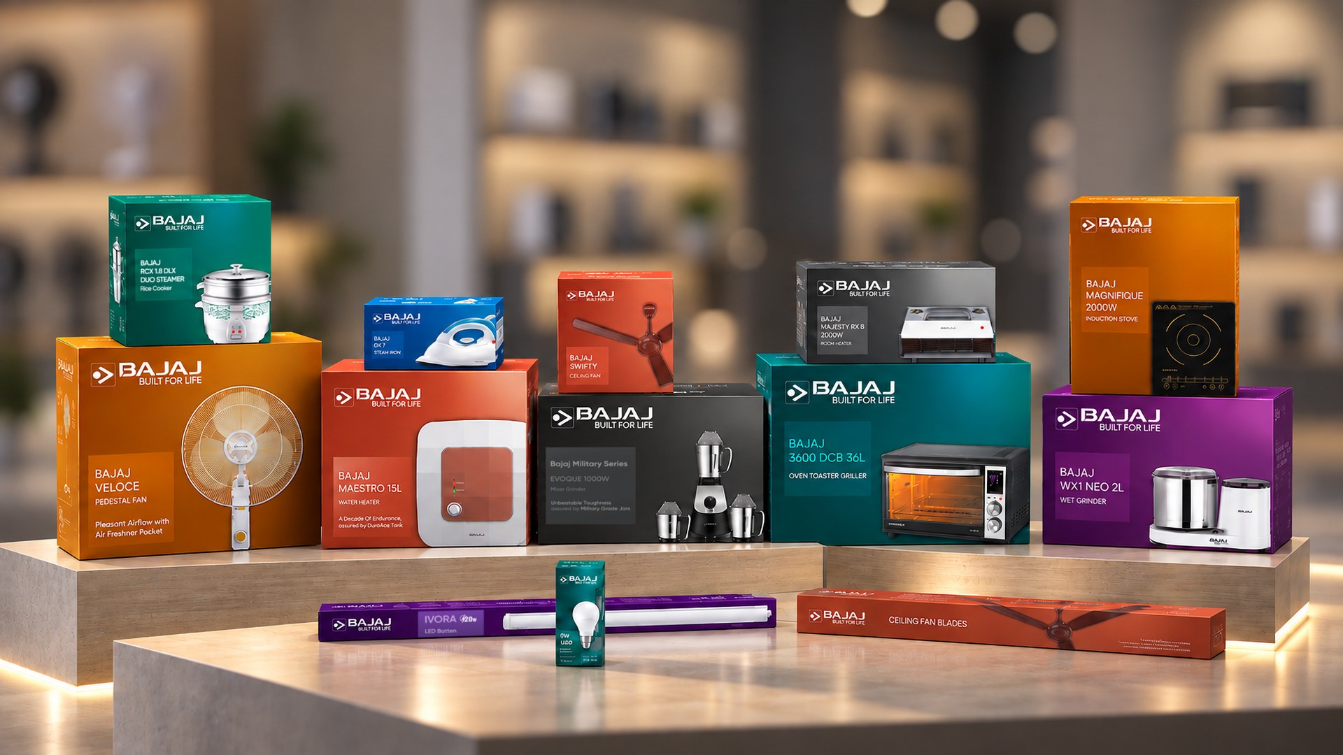
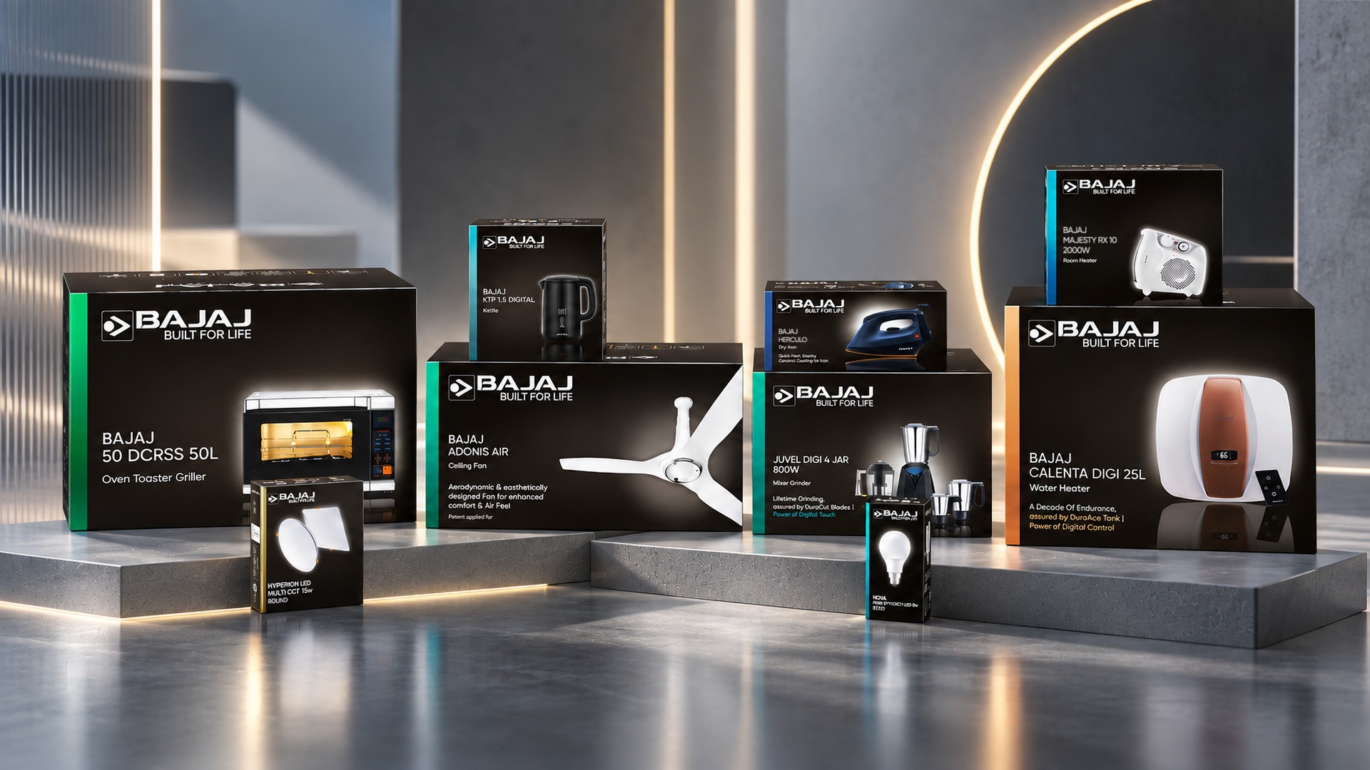
We established two clear packaging architectures:
PREMIUM | REGULAR
Rather than forcing the entire portfolio into one visual treatment, we created differentiated expressions for the two categories while maintaining a consistent Bajaj brand identity.
The new system strengthened:
• Brand recognition through a consistent visual signature.
• Shelf impact through a stronger hierarchy and a more distinctive composition.
• Product comprehension through clearer product imagery and information architecture.
• Portfolio navigation by creating a clear distinction between Premium and Regular.
• Retail execution through a coherent system that could work across multiple product lines and price points.
The design therefore worked across the purchase funnel:
Attention → Recognition → Understanding → Comparison → Choice
And the economics followed.
CAC ↓
Greater shelf visibility + faster brand recognition + clearer product communication
→ reduced discovery and decision friction
→ more efficient conversion at the point of purchase.
CapEx ↓
A systematic packaging architecture rather than individual pack-by-pack solutions
→ greater reuse of design principles and assets
→ more efficient portfolio-wide implementation.
OpEx ↓
Clear information hierarchy + standardised visual principles
→ easier adaptation across products, teams and retail environments
→ reduced design and execution complexity.
Scale ↑
Two scalable packaging architectures across multiple product categories and price points
→ consistent Bajaj presence without forcing every product into the same visual expression.
Lokusdesign transformed Bajaj’s packaging from a product container into a point-of-purchase brand and business tool.
Retail Research → Competitive Insight → Portfolio Architecture → Distinctive Packaging System → Stronger Shelf Presence → Easier Choice
The result was a stronger visual signature for Bajaj across product lines and price points – helping the brand compete more effectively in a crowded retail environment while retaining the recognition and trust built over decades.
Lokusdesign did not simply make Bajaj packaging more contemporary. We designed it to work harder – attracting attention, building recognition, simplifying choice, and strengthening the economics of the point of purchase.