Okaya’s portfolio had evolved into a collection of distinct series – including Smart, Xtra Power, Viva, Supergel, Gold, Gold Plus and Platinum – each addressing a different proposition, from economical and low-maintenance solutions to longer life, deep-discharge capability and premium performance. At the same time, the competitive landscape was crowded with multiple product names competing for consumer attention.
The challenge was therefore twofold: build a strong Okaya family while making every series own a distinct space within it. The system needed to make the relationship between the brand, product series, value proposition, name, and packaging clear and intuitive.
Lokusdesign began by defining the strategic value hierarchy of the portfolio. Rather than treating every series as an independent product, each was mapped against its customer value proposition – such as faster recharge, longer life, low maintenance, deep-discharge performance or premium high-cycle capability. This created a clear foundation for differentiation and established a sharper role for every product within the Okaya portfolio.
The next step was to create a systematic naming architecture. Names were explored not as isolated brand assets, but as part of a larger family – designed to be easy to understand and remember, relevant to the category, and capable of building both Okaya recall and product-level differentiation. The recommended architecture explored names such as PowerGO, PowerON, PowerECO, PowerGEL, PowerPRO and PowerMAX, creating a stronger connection between name, hierarchy, and customer benefit.
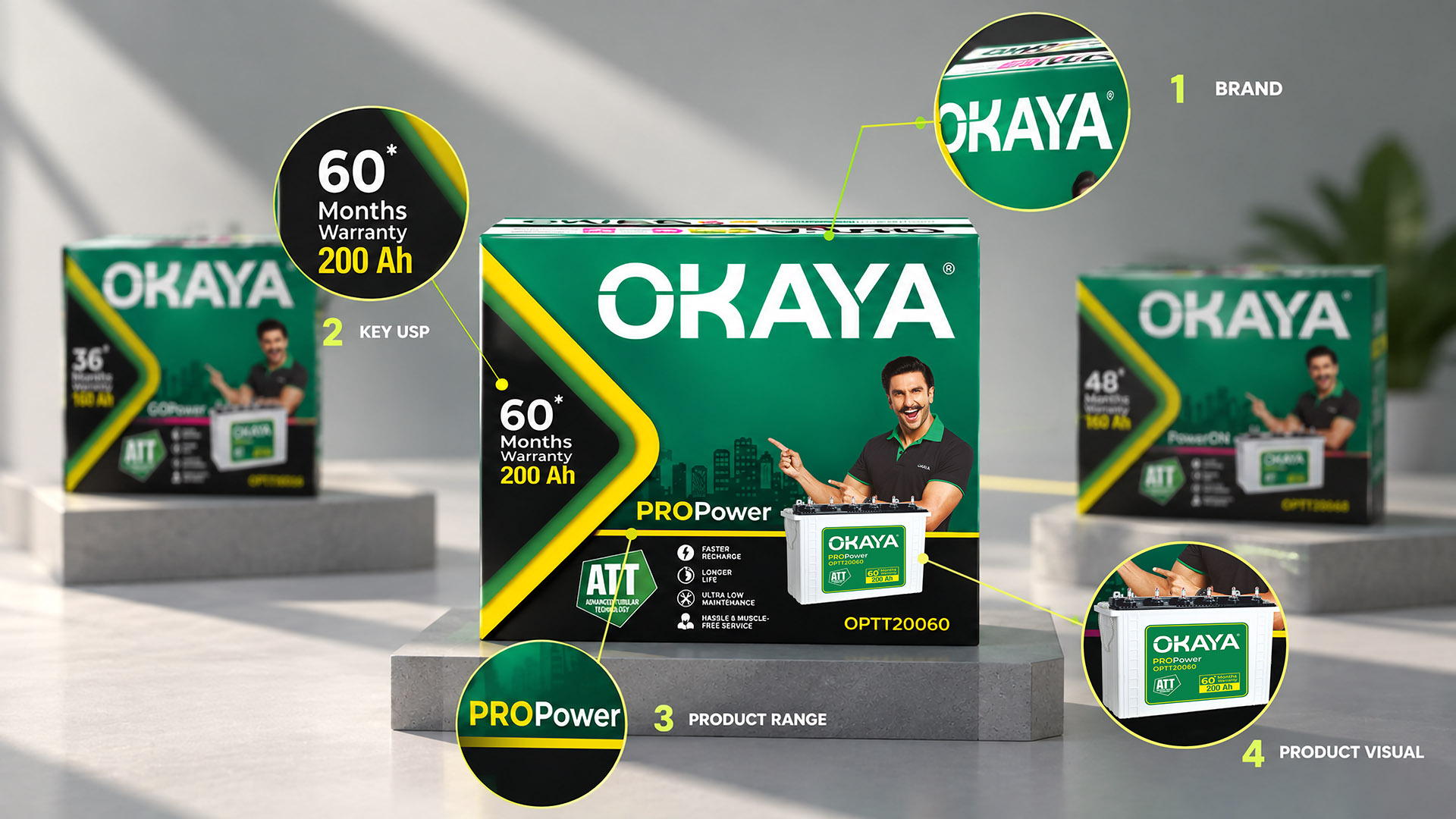
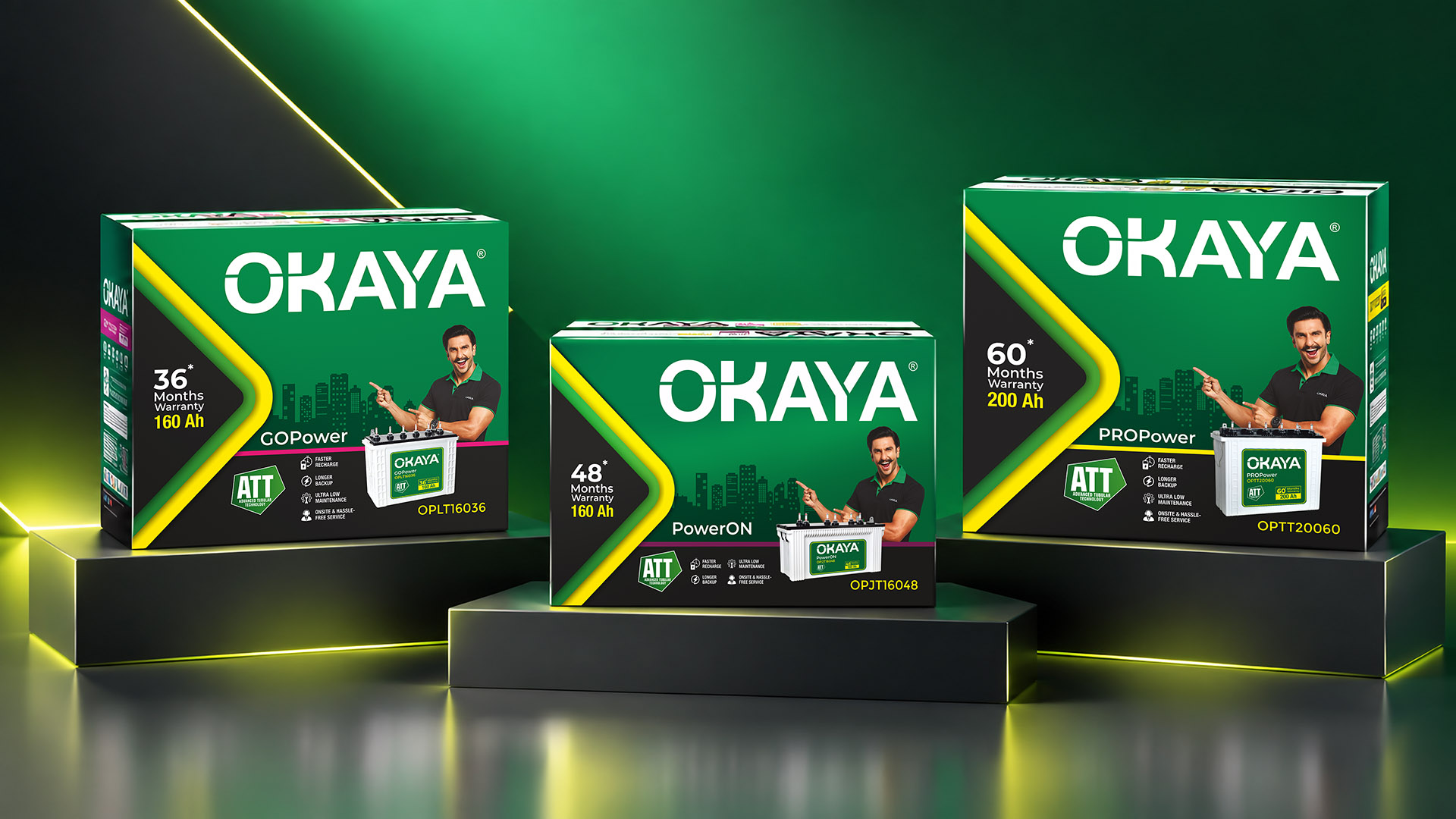
This strategic architecture was then translated into packaging. A consistent Okaya presence established family recognition, while differentiated colour, graphics and hierarchy helped communicate the distinct positioning of individual product tiers. The result was not a collection of disconnected packs, but a scalable visual system that could grow with the portfolio.
The transformation moved Okaya from a collection of product names and packs to a structured brand architecture with differentiated value propositions – creating a stronger foundation for brand recall, portfolio clarity and future growth.